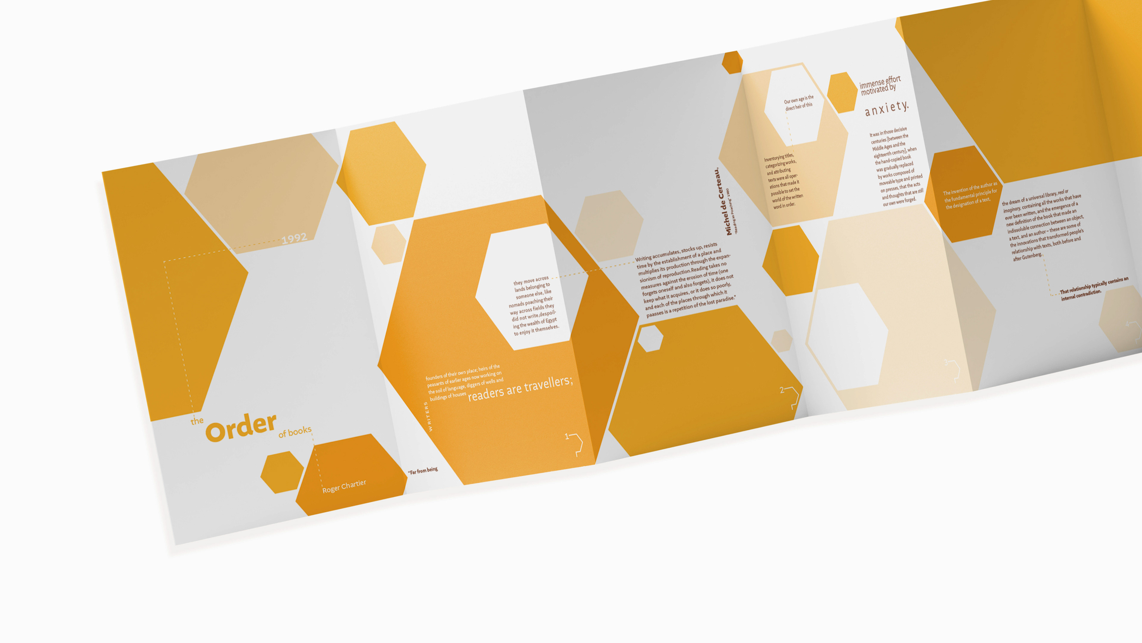
"Typography in Context: Claude Garamond" features an original research essay about Claude Garamond's life, presented on a two-page poster set. In the composition, letterforms are incorporated and focused at the center of the two pages, adding a typographic twist to conventional writing while highlighting elements of the typeface. A key lesson learned from this project is the importance of carving out negative space to create a composition that is easy to read.
Skill: Adobe Indesign


